It is interesting to compare the stylisation of words in logos of high-end designer fashion brands in comparison to low-end fashion brands. Whilst in some brands there are stark differences between the typography, in others it is more difficult to distinguish luxury from low-end.
This article looks at two brands which present some stark differences in their logos: high-end Italian designer brand Gucci, and low-end high street brand H&M.
Gucci is unarguably one of the most recognised designer brands internationally for its sophistication and grandeur, and in particular for its classic bags featuring the world-renowned logo. H&M as a high street shop is also well known internationally for cheap fast-fashion that provides basics and some current trends, and opens them up for a wider market due to affordability.
![]()
In Gucci’s logo, we can see a serif font with a relatively high contrast. As Chapman tells us in her article ‘Lines of Communication – A Typeface History’ in the 1780s, type designers Firmin Didot and Giambattista Bodoni ‘created modern serifs with extreme contrast between strokes, which ‘showcased the quality of the metal-casting work done by the respective companies, as thinner strokes required much better craftsmanship’.* This signifies that serif started out as a higher class font and has kept its status as it is still associated now with affluent brands. The contrast makes for an elegant appearance, whilst the quite heavy weighting still comes across as bold and powerful. Furthermore, the logo of the G and inverted G is simple, elegant and certainly memorable, which is important for consumer recognition and loyalty: the logo represents the brand, and the consumer will want to be associated with that brand, and so seeing the logo on items will encourage purchases and increase brand-customer loyalty.
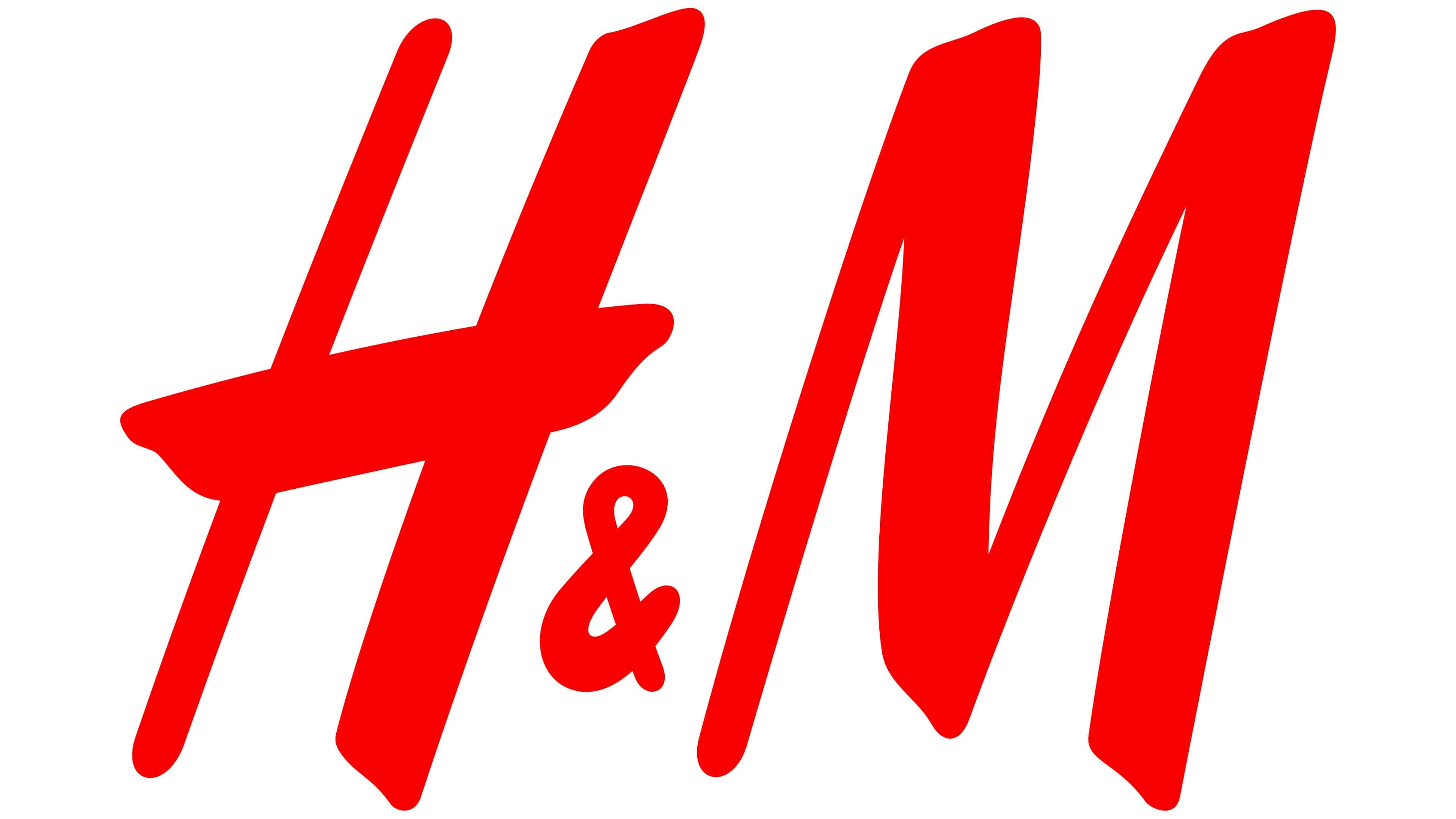
As for H&M, their logo is in the type classification of handwritten. This is appropriate for this brand because it implies that they value fun and creativity over sophistication and luxury, therefore directing themselves more towards young teenagers and those from a less wealthy background that still strive to express themselves through fashion. Their logo also features quite a high contrast, but in this case rather than looking elegant it increases the handwritten and purposefully messy appearing logo, mimicking paint brush strokes; this signals to creative expression, aligning with H&M’s mantra: “More fashion choices that are good for people, the planet and your wallet.” The bold choice of red is significant as it stands out from the usual choice of black, and this is a clever marketing choice because it makes the brand easily recognisable internationally: wherever in the world someone is, they will see the H&M logo and know exactly what the brand will deliver them in that shop.
From this short comparison, it is hoped that you can see the significance of typographical choices in the way in which a brand presents itself and is remembered by consumers. It is clear to see that choices are always crafted, and no matter how cheap or expensive the brand, identity will always be at the centre-point.
References:
*1: https://www.toptal.com/designers/ui/typeface-history